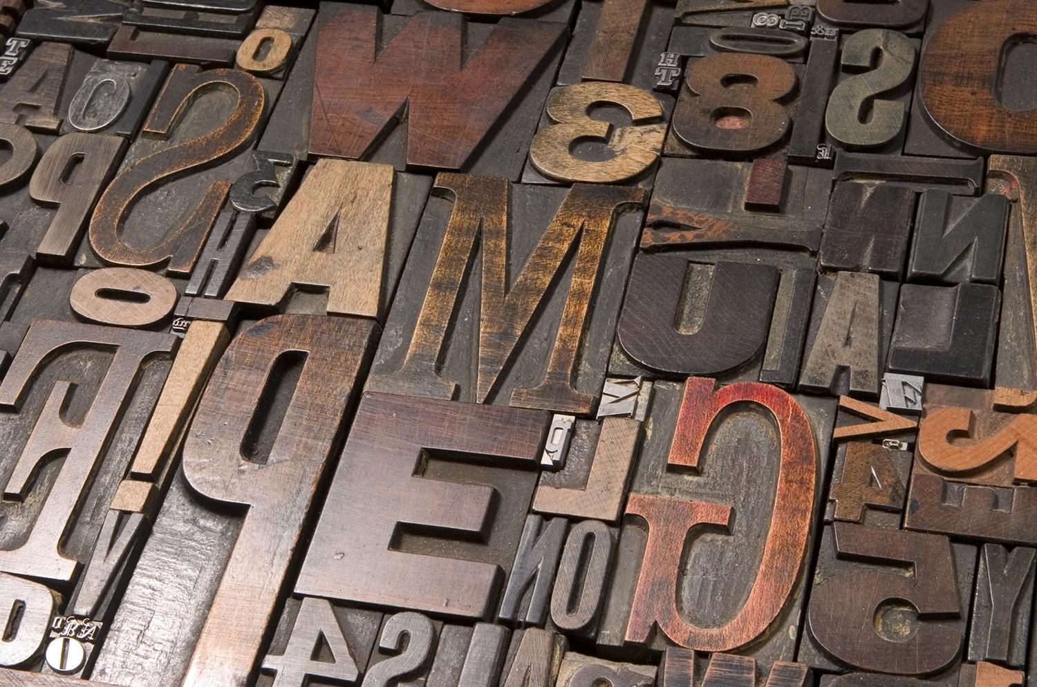
The complex world of type.
For some people, it’s only a font! For others with a keen eye, it’s a passion, it’s a frustration and it matters a great deal. But what’s up with just using Arial or Times New Roman (or any default font)? Why is it so important to choose the correct font? What is all the fuss about?
Maybe the sensible thing is to start at the beginning, so a quick history lesson.
It all started in caves when humans were painting on walls. This evolved through pictographs, ideographs, hieroglyphics and the Phoenician alphabet (c.1050 BC). The Greeks then started incorporating vowels before the Romans developed their own alphabet that had 23 letters. Moveable type was invented in China (c.1040 AD) using clay and wood, and with advances in printing (notably the Gutenberg press) lead and tin were utilised. Typefaces (as we know them now) began to appear in the mid-fifteenth century and by the 1540’s, Claude Garamond was asked by the King to create a typeface for a series of books. A couple of centuries later and the world is awash with fonts – from the safe to the obscure, from the classic to the comedic, from the historic to the futuristic. There are literally thousands of typefaces and there is something for everyone.
Now a basic type lesson.
A ‘font’ is the complete set of characters (or glyphs) of a particular style (roman, bold, italic etc) or size. Garamond Regular, Garamond Italic and Garamond Bold are all ‘fonts’. A ‘typeface’ is the actual appearance of a font. ‘Garamond’ is a ‘typeface’. Before the digital age, the meanings of ‘fonts’ and ‘typefaces’ were widely understood, but nowadays the terms are interchange with each other. ‘Typography’ is the art of ordering and positioning type, which includes its style (light, bold, italic etc) and its appearance.
A ‘serif’ typeface is one that has a graphical detail (which could be a line, a flourish or a curve) added to a character. These ‘details’ are called ‘serifs’ and can help with reading. ‘Garamond’ is a serif typeface. A ‘sans serif’ typeface is has no line, flourish or curve added to it (the French word ‘sans’ means ‘without’). They are ideal for learning how to read as the character forms are similar to handwriting. ‘Arial’ is a ‘sans serif’ typeface. According to Linotype, the top five most popular typeface releases in 2011 were (in order) Akko (sans serif), Haas Grotesk (sans serif), Camphor (serif), Rabenau, Rotis II Sans (sans serif).
Default fonts are just as good, right?
Well, they have been singled out for a reason, mainly because they work equally well on paper and on screen. Arial (whilst being near the top of any font list, also has an extensive font family) and Times New Roman (designed specifically as a newspaper typeface to save page space) are default fonts that can be selected in seconds. However, they also carry a stigma – Arial is viewed as a cheap imitation of Helvetica and Times New Roman is so widespread in its usage, it’s simply lost its charm.
There are many examples of typefaces that aren’t default choices but have gained notable prominence – Comic Sans (designed in 1984), Papyrus (designed in 1982) and Brush Script (designed in 1942). Comic Sans is reportedly one of the most legible typefaces, particularly for people who are dyslexic (it appears on many school newsletters and in comics). Papyrus was used in the credits and subtitles of one of the highest grossing films in history (Avatar). Brush Script was used for the original opening titles of Australia’s longest running drama series (Neighbours). But fame is often overshadowed by misuse, overuse or, quite literally, being typecast.
One recently created typeface in particular has divided opinion globally – that of the London 2012 Olympics. Specially designed for the occasion, it has managed to create as much publicity as the event itself (with a little help from the logo too). Opinion about it has been strong and detailed but will that help elevate it to becoming famous or infamous?
But why the fuss? People seem to bicker about fonts in the same way as rating a film – most of the time, there is a general consensus but sometimes it leads to convoluted disagreement. Often it’s the typefaces that create affection and admiration that go unnoticed but a more controversial choice will spark irritation, annoyance and passionate opinion. Like appreciating the delicate flavours of a fine whiskey or listening to the mechanics of a healthy vintage car – the ascender height, a protruding spur, the thickness of a bar or the x height – it’s about every single element that makes up the entire entity. It’s simply the difference between knowing and not knowing.
So, what’s in a font (or typeface)? Evidently a great deal. It’s more than just a list too – that is just the tip of the iceberg.


Submit a Comment