I’m a great believer that any tool that enhances communication has profound effects in terms of how people can learn from each other, and how they can achieve the kind of freedoms that they’re interested in.
Bill Gates
There are numerous complex processes, timelines, maps and data that exist in this world. At some point you will either be trying to teach, navigate or learn something.
Enhancing and simplifying a complicated message using an infographic can aid in understanding and retention of the pages of words and lessons that follow.
Visuals are remarkable in their ability to communicate a message to people from different cultural backgrounds, who speak different languages. An entire process can be shown without the use of words, helpful for those from a non-english speaking background.
Many times a very dry theme can be made more interesting by using visuals to break it apart.
Imagine trying to put together a flat-pack bunk bed that was made…overseas…using words alone. How many pages would it take to explain what pieces should be in the pack and what they look like?
Imagine trying to describe the difference in the size and shape of the screws, let alone all the other items, and how they’re meant to fit together.
Now imagine trying to put the bed together, reading only the words that were written by the factory owner’s cousin who…doesn’t speak english very well! We’ve all been there.
My friends, you have a nightmare scenario brewing. Your frustration levels will get so high that you will have an argument with your wife/husband just because they asked if you’d like a cup of tea.
Keep It Simple
A simple inventory illustration at the top of the instructions is capable of summing up pages of written information.
Many of us, in our day-to-day activities, work out how to construct something by using the infographic to understand the text.
That is the power of infographics. Complexity broken down simply, succinctly and visually — the ‘aha’ moment.
Infographics are a specialist skill. It’s very easy to create a graphic that’s complex and confusing. As with all pursuits in life, simplicity is the desired outcome, it requires the designer to spend time understanding the core message and then reflecting that understanding in a meaningful visual story.
If you’re working with somebody to develop an infographic, the initial diagrams supplied to you will probably be overly complex. Your analysis and refinement will ensure a better result. It may take several iterations and honest appraisals, but these are all part of the process.
Storytelling
Scientists and academics have been using infographics for centuries to aid viewer analysis. One of the main criticisms of these kinds of infographics is that they’re very dry and boring.
More recently, using infographics for editorial commentary has expanded their usefulness and popularity. The more visual approach helps to capture the readers attention and aid with retention later on.
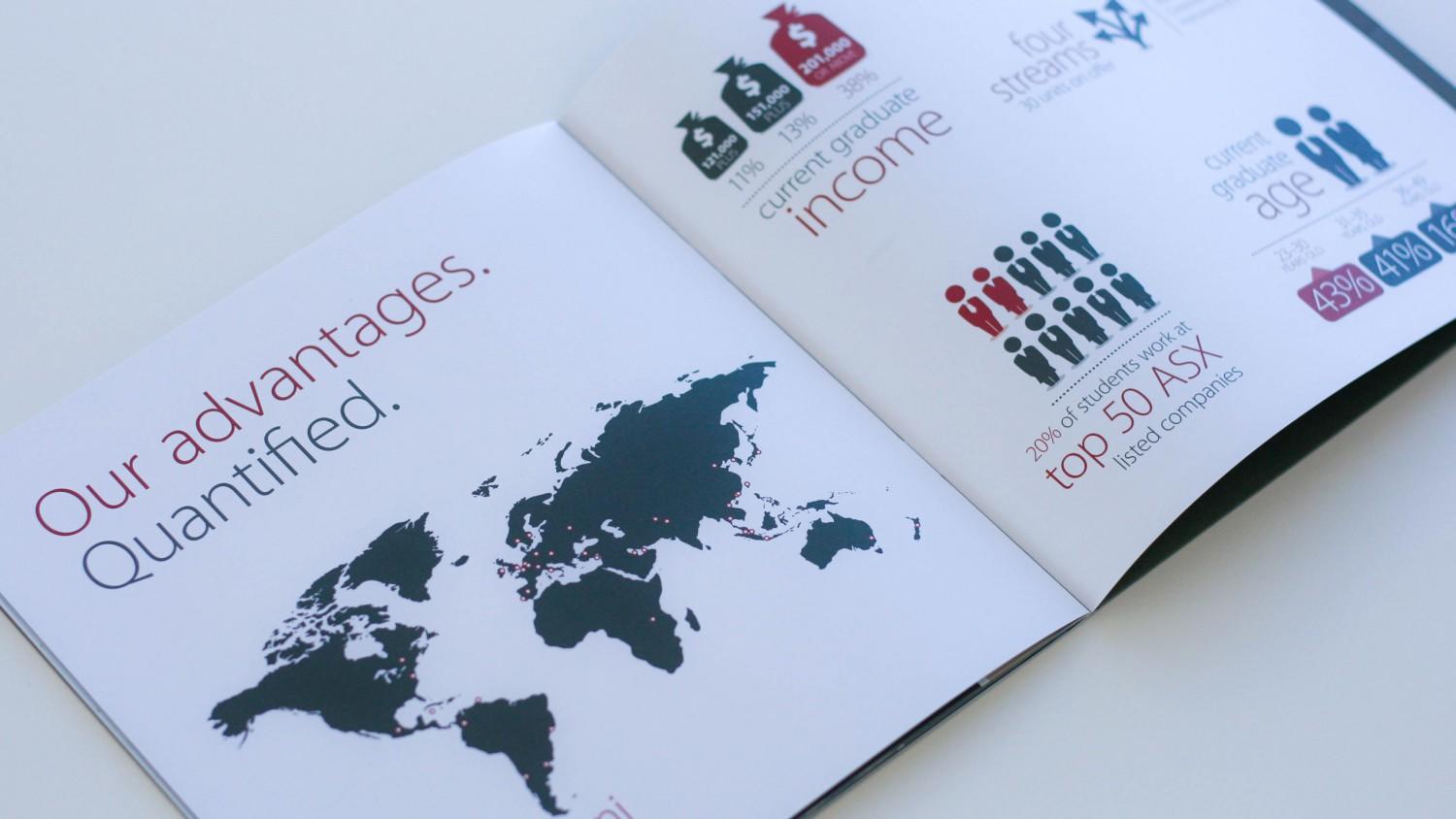
If you’re in Higher Education, consider an infographic to help explain the text for prospective international students to better grasp the enrolment process. Three intimidating pages of text can be summarised visually and ease frustrations for non-english speaking students.
In Higher Education it’s common to overwhelm people with very detailed information and simply not give it another thought. Consultation with your audience can help you evaluate your current communication style and give you areas for improvement.
Once you find a weakness, focus on making it simpler and clearer. Consider the power of a simple, well illustrated infographic to aid in engagment, understanding and retention and give your designers the latitude to come up with a creative solution.


Submit a Comment